Project - 2020
![]()
Heineken DOT B2B platform
About Heineken DOT
Heineken DOT is a B2B drinks ordering platform, it is a responsive website and available on Android & iOS app store.
I started to redesign for the mobile and desktop version in 2020 with a UI designer. Within less than a year the redesigned platform was launched in Indonesia.
It is currently available in more than 7 countries, such as Egypt, Malaysia, Nigeria, Russia and more.
My Role
- User research
- Interaction design
- UI design support
- User testing
- Project planning
Business Goals
- Increase native user number
- Increase top line growth
- Reduced Technical Cost
Challenge
- Users are 40+ years old, not tech savvy, and we don't have direct access to the users, so building empathy with them is not easy.
Design Process
User research
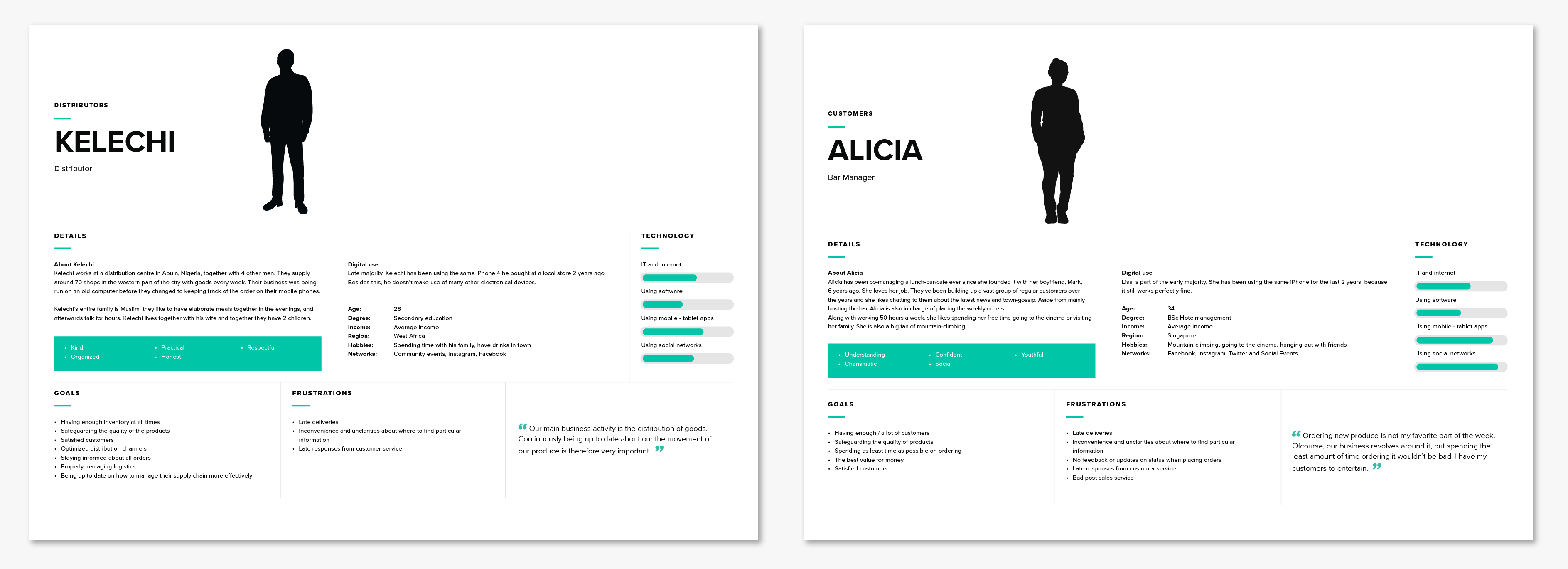
It is hard to interview users under the COVID limitations, but luckily Heineken has a very close relationship with local POs, so we sent them a questionnaire in order to gain some insight about users. Heineken also provided us with user research they have conducted before the COVID, which helped us in creating these personas
Personas
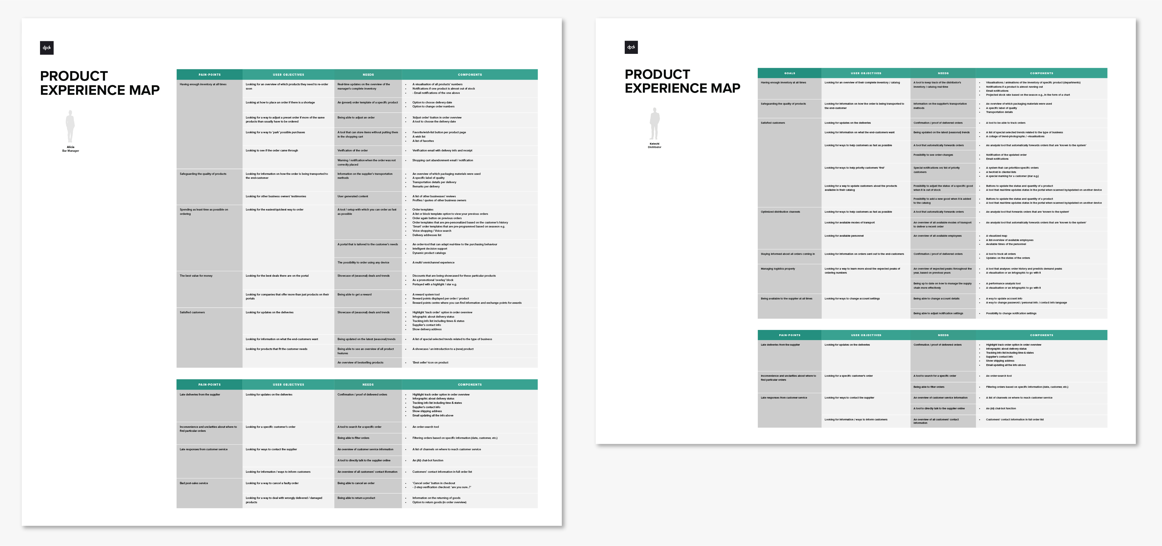
User experience map
I created 2 user experience maps from different business scale owners. We listed all the users’ needs based on personas, the final result is the features which we suggested to add in this platform.
Homepage redesign
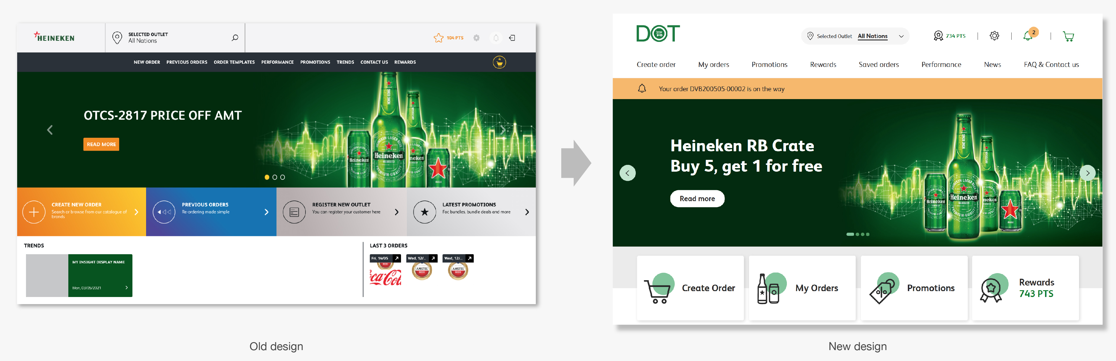
Problems on homepage
Our team did an assessment on each page and flow, we combine the user insight from Heineken team to come up with these problems on the homepage:
- The drop rate is high
- Poor visual hierarchy, lack of focus
- No clear guidance to the order flow

Goals and Solutions:
1. Engaging users start order from homepage
- Add outstanding CTA buttons
- Add a product catalog
- Add a promo product carousel
- Change color schemes to be more appealing and

2. Quick access to main features
- Add Notification bar
- Add notification overlay
- Add setting overlay

2. Gain trust from users
- Add USP & introduction of this platform
- Add chatbot give user support
- Add FAQ
4. Clear visual hierarchy
- CTA Consistent button styles
- Use standard color to deliver clear information
- Design logical space to give more focus

Order flow redesign
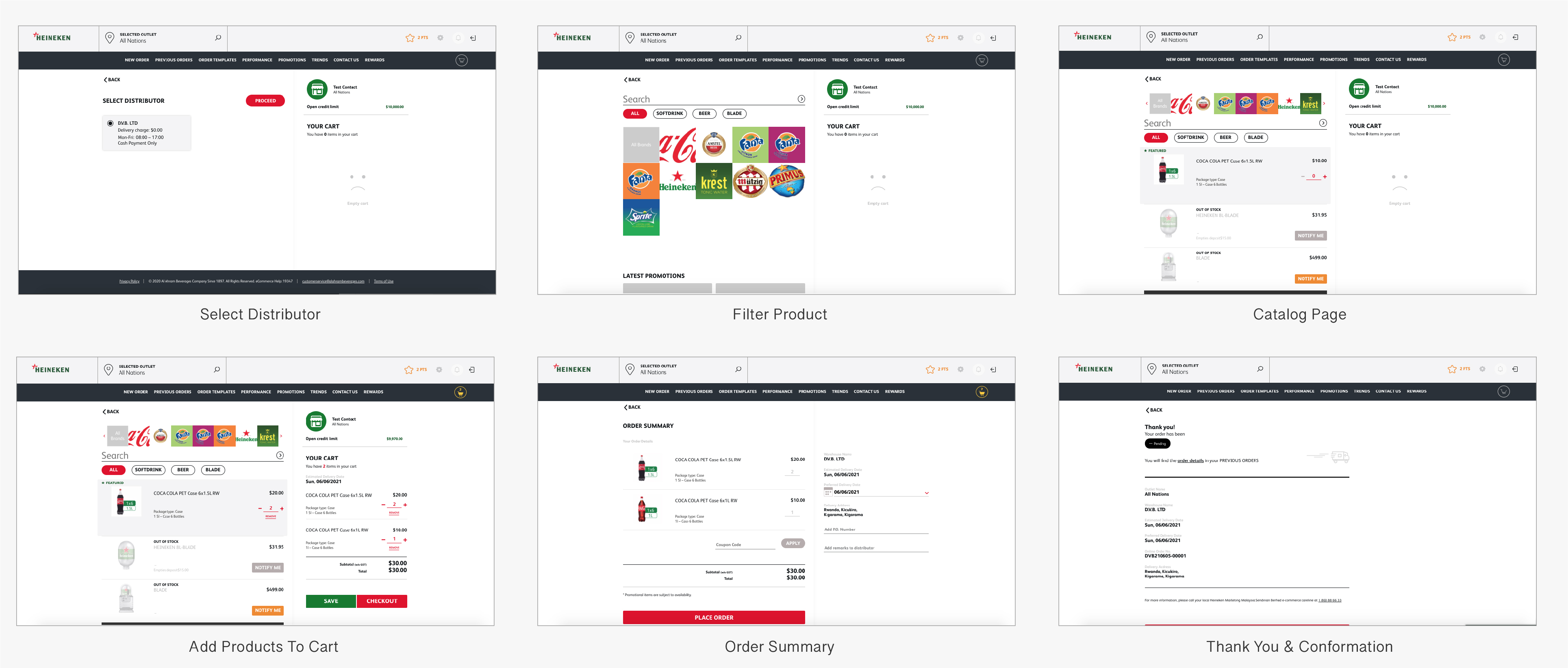
Problems:
1. Conversion rate is low
2. Poor visual hierarchy, lack of focus
3. Filter interaction is low
4. Taking many steps to start ordering
5. Redundancies in user flow
Combining user research and these problems,
I found the following goals and solutions:
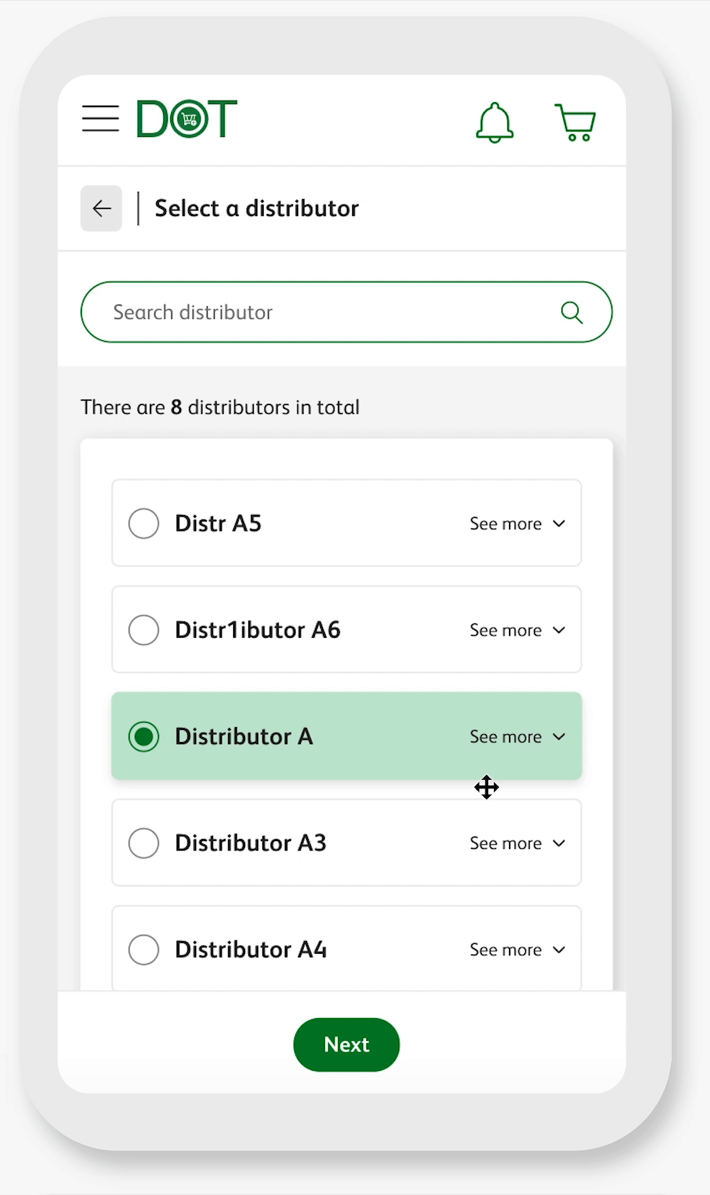
Simplify flow
Users need to select a distributor each time before ordering. We cannot avoid this step but we can streamline it.
Solutions:
- Add a Predictive search bar, when users type on it, it shows the relevant results
- Pre-select the last selected distributor option
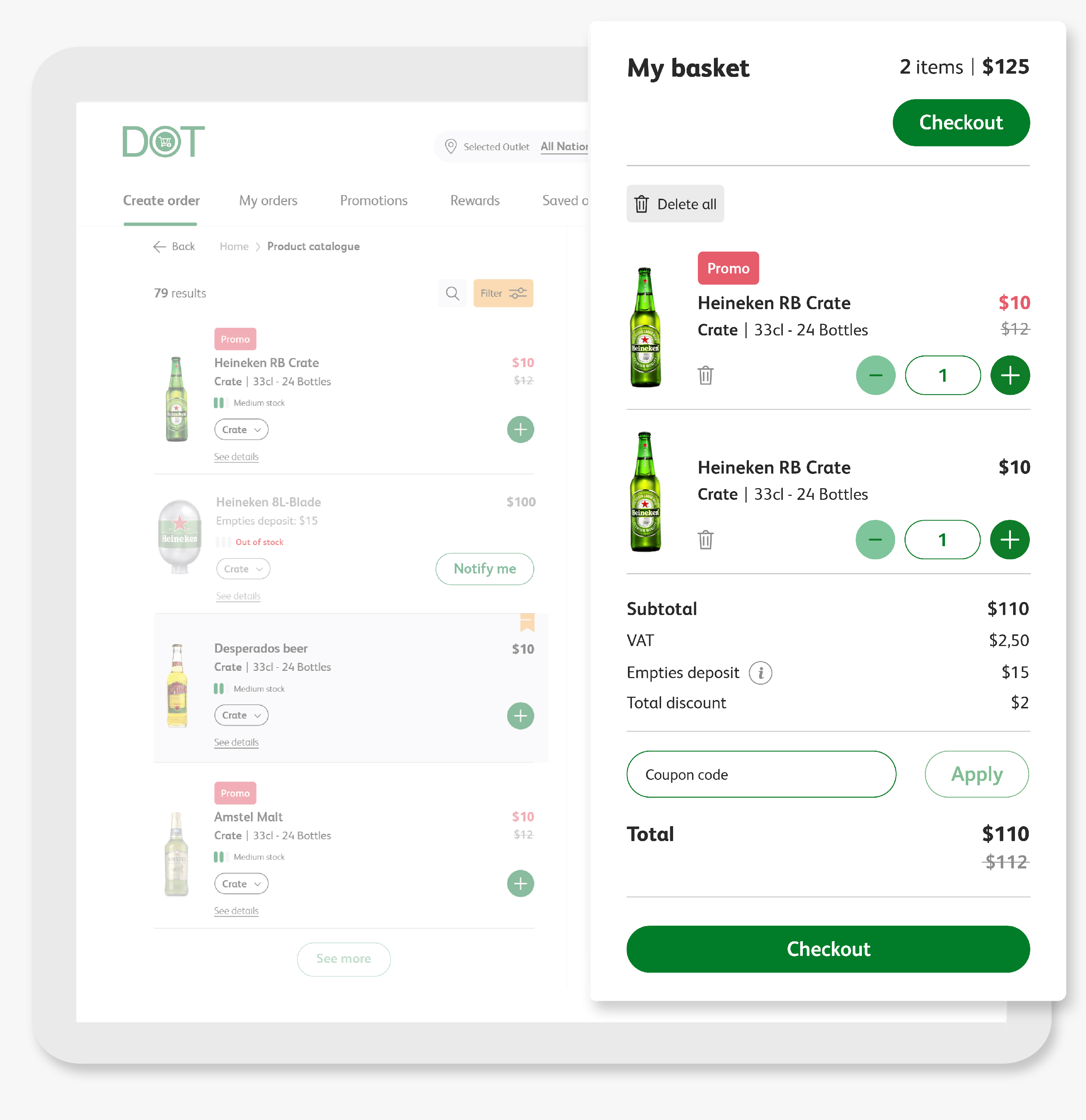
Give users clear guidance & support
Solutions:
- Prominent CTA button
- Simplify quantity button interaction in product card
- Move the coupon code to the cart section instead of the summary page, so that the user could see the discounted price before checkout
- 2 checkout buttons - quick checkout without scrolling
- Add order overview on the top of the cart to provide a glance of the order
- Add Delete all button on cart page give user a fluent editing experience
Clear product information in the product card
Solutions:
- Usage of promo label presents a clear visual hierarchy
- Add inventory level
- Better organized product package type information

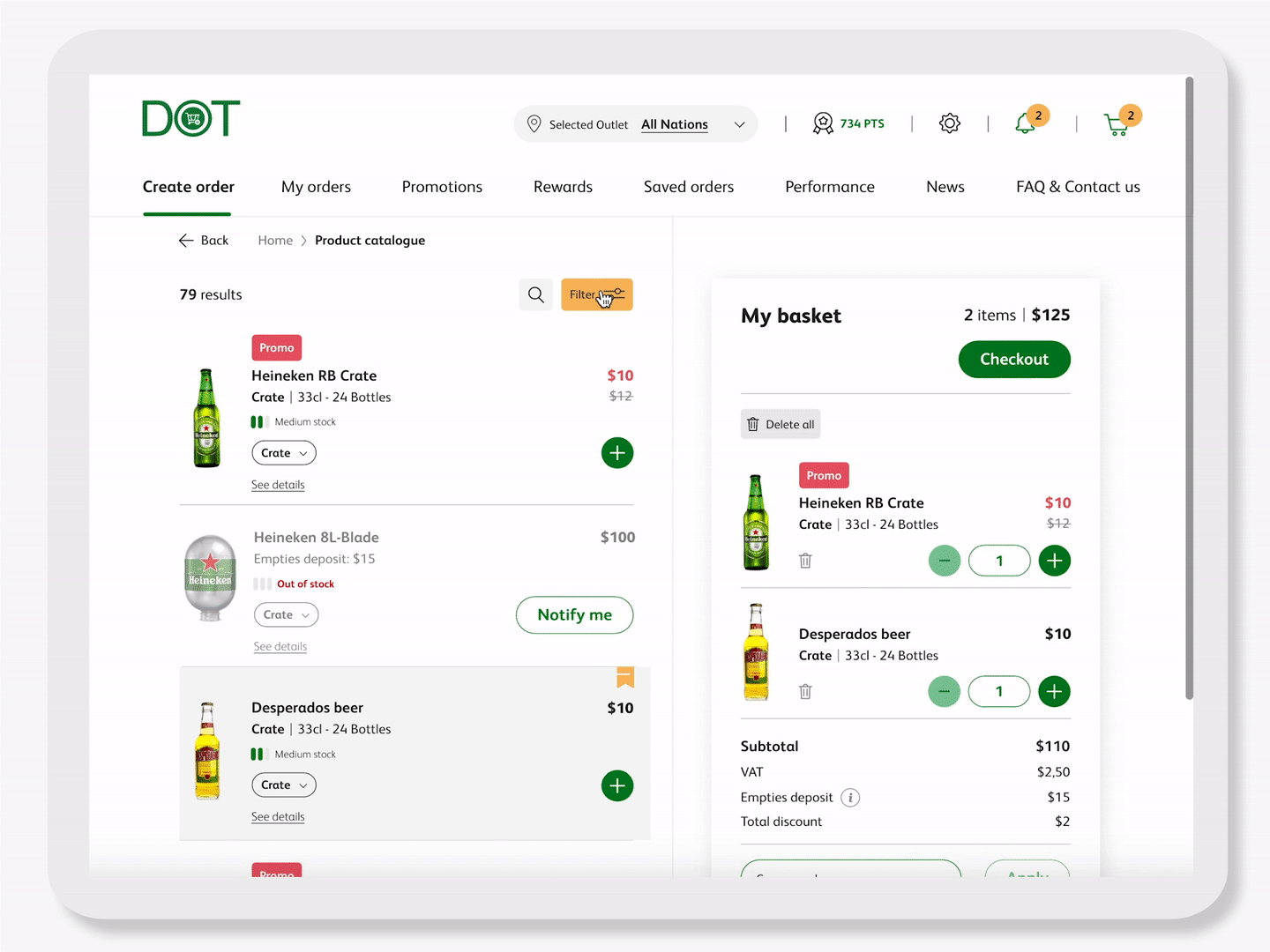
Improved Filter design
Solutions:
- Add a filter overlay while leaving enough space for catalog
- User can select multiple brands and categories at the sime time with an overview of their selection
A usability test for validating the designs, this is the result:
+ Users would mostly scroll or use the search bar to find products
+ The users like how the products are displayed, it has all the information they need
+ Customers can see the number of products on the top, that will incentivize them to scroll
- Users indicated they miss the brand filters on top. The filter button presented in the new design is not being used by any of the participants
- Communication of the featured product is not clear, What does "feature product"means?
- The add to cart interaction is not clear. They miss the ‘regular’ quantity selectors
The learnings
Overall the feedback is very positive, testers were very happy when they saw the new platform.
From the negative feedback, we can see that we overestimated users' acceptance. This new design lack enough indication for them, especially since our users are not tech savvy, we need to be aware that every small change for them is enormous, it costs extra time for them to adopt changes.
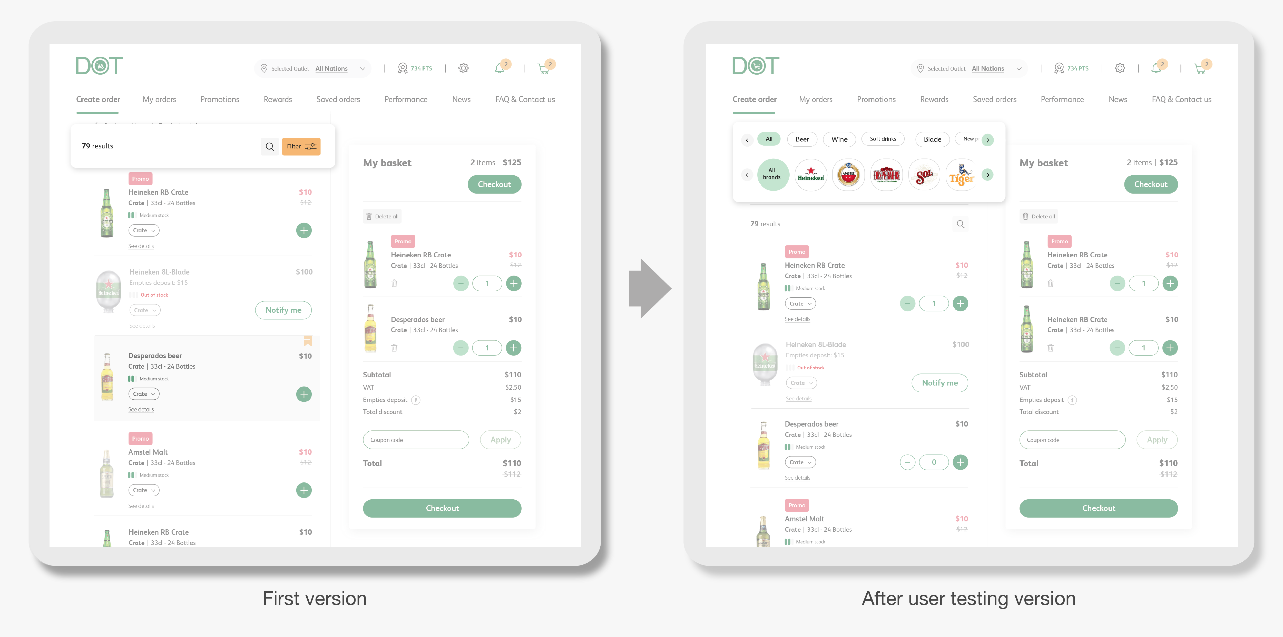
Iteration after the usability test
Users couldn’t find the filter easily.
Solution:
Since users are used to seeing the filter directly on the catalog page, we chose to not hide it under a button. In the new design, there is clear division on brand filters, this makes for more organized and easier to scan visual.
Users doesn’t know what is "featured product”
Solution:
This naming is ambiguous, we changed it to Buyers’ choice, the research shows that social prove has a positive impact on order frequency (+10.4%)
The add to cart interaction is not clear
Solution:
Add quantity selectors gives users clear indication.

The outcomes
Improved order via defined metrics on the redesigns, including
• Reduce the drop rate on homepage
• Increase the conversion rate
• Increase the number of active user
• User feedback like "I enjoy the new order flow way more", "I like to come back here and redeem beers"
Highlighted pages
I redesigned the UX for promotions, my orders, order template, rewards, performance, contact us and chatbot pages. I don’t show them all here, but you can see some highlighted pages designs below:

Design system
Another important part of this project is creating a design system for this platform, I have supported our UI designer in completing this design system: