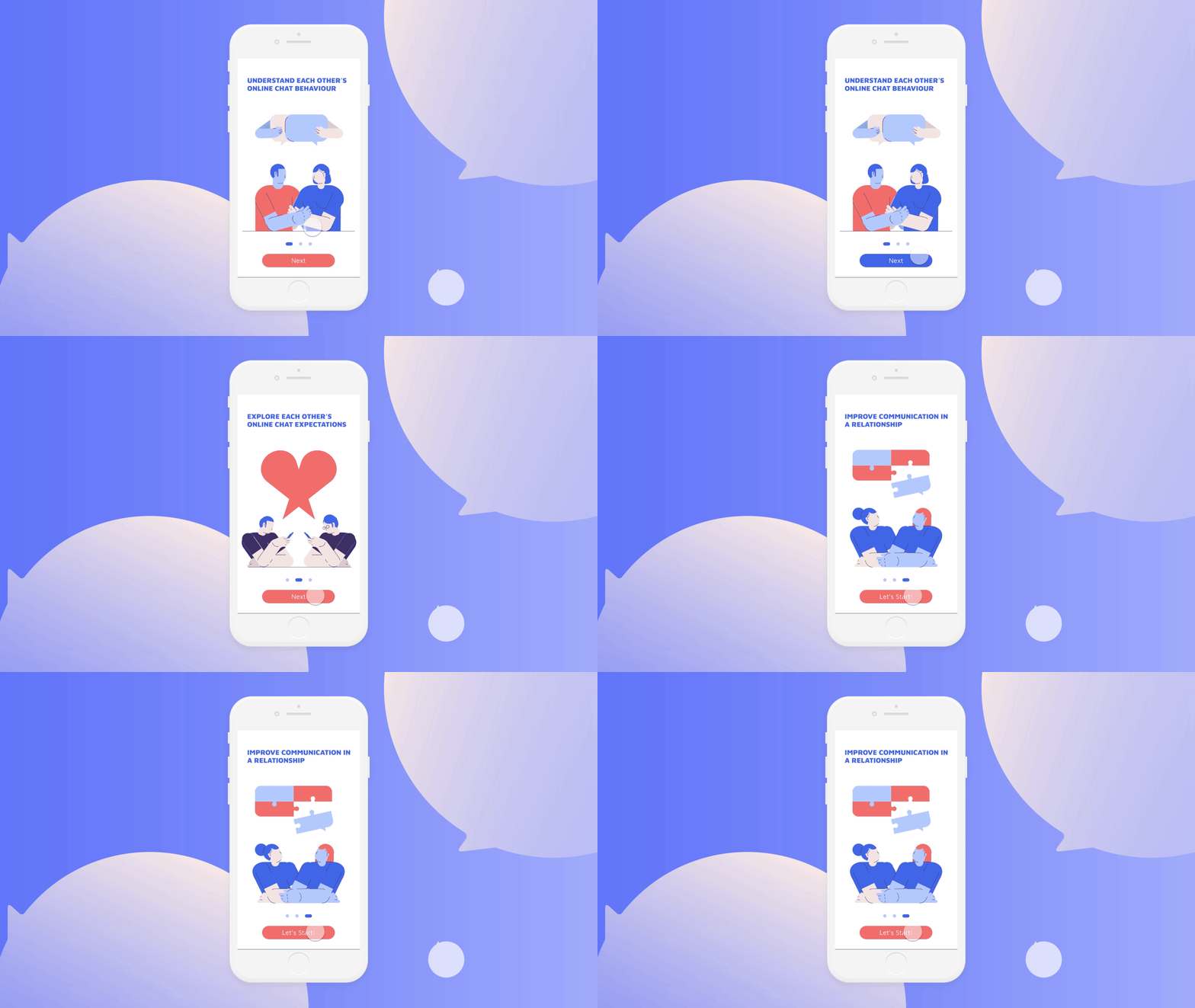
About Nino
Nino is an application for couples to communicate their online chat relationship problems. Please scan this QR code to experience a short tryout version by your phone or visit this website on your phone ninoapp.live

My Role
-
User Research
- UX Design
- UI Design
- Concept Developing
The Challenge
- How to help them overcome their fear to raise their questions and problems?
- How to visualise their feelings about online relationship ?
Design Process
Design Process

Nino is my master graduation project aimed at helping couples to open themselves to talk about their problems from online chatting.
My online survey shows that nearly half of the participants won’t vocalize their frustrations. In order to find out the reasons, I interviewed some people to create personas and a user journey in order to understand:
My online survey shows that nearly half of the participants won’t vocalize their frustrations. In order to find out the reasons, I interviewed some people to create personas and a user journey in order to understand:
- User’s goals
-
Motivations
- Pain points
Psychology and couple's therapy research helped me in creating the solution to guide couples to open themselves and experience positive communication.
For interface design, the interactive design based on visual metaphors allows users to identify and visualize their abstract feelings. I did 3 rounds of user testing in order to optimize the user experience.
For interface design, the interactive design based on visual metaphors allows users to identify and visualize their abstract feelings. I did 3 rounds of user testing in order to optimize the user experience.
What Are The Problems In Online Chat Relationship ?
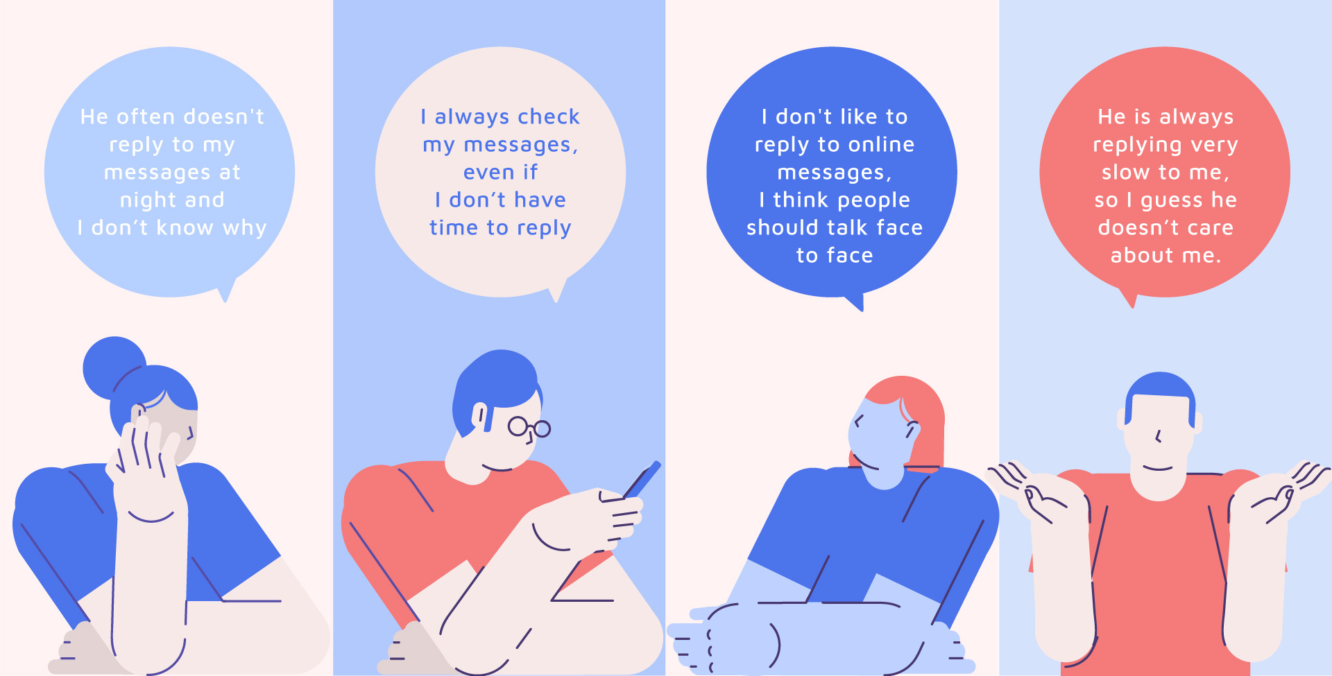
Observation
My research shows people have different online chatting attitudes and expectations.
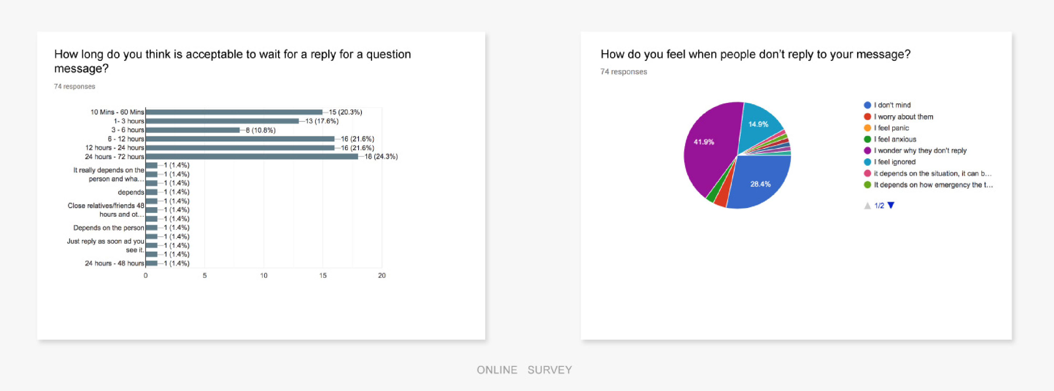
How do couples deal with problems from online chat?
When people have negative emotions, like feels ignored by their partners, nearly half (48.6%) of the participants won’t vocalize their frustrations.

Persona
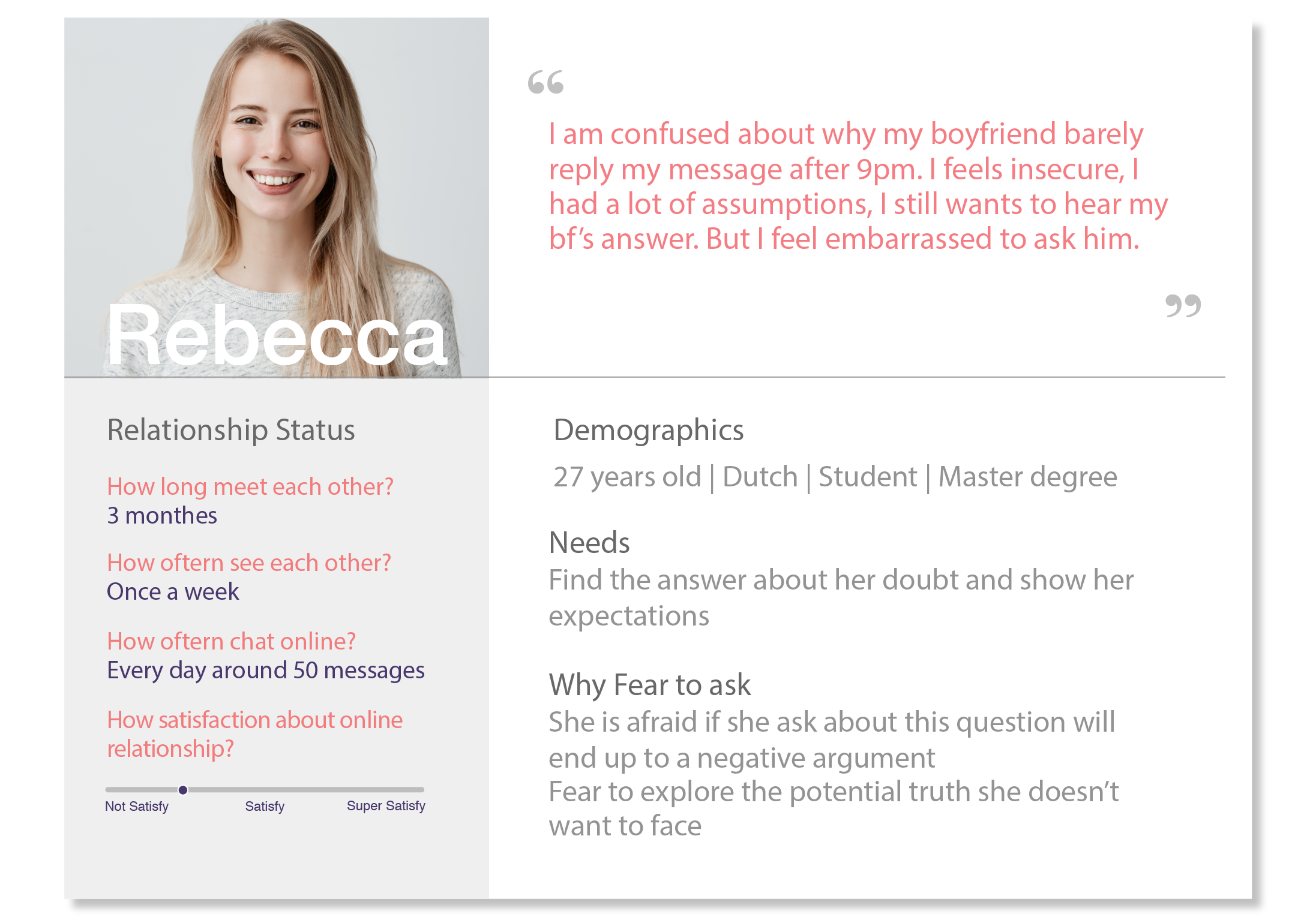
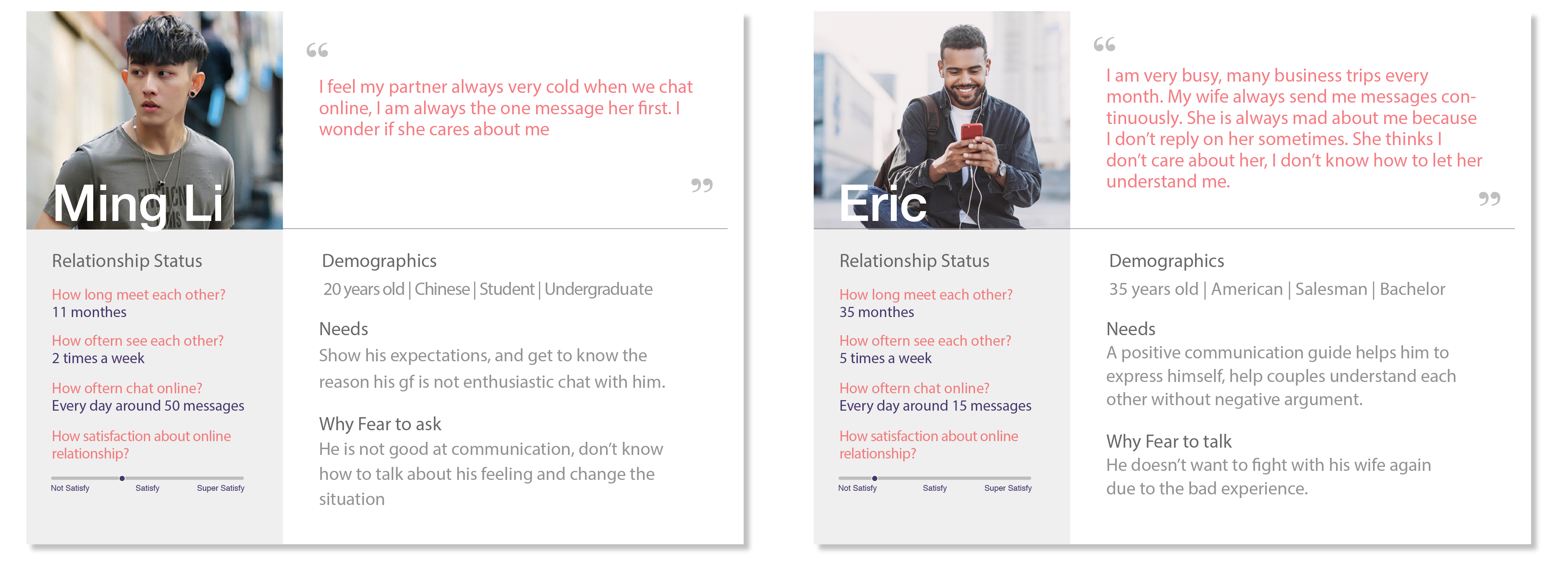
In order to find out why they don’t talk about their frustration, I did user interviewed. Instead of knowing customer needs I am more interested in knowing their fears in this case.
After the interview I found out They don’t know how to communicate these problems in a relationship is the main reason why people don’t talk about it.
How can I use design to improve their problems ?
To design an app help them to raise their confusions, also provide them with a positive communication guide help them address the concerns.
Target Audience
The app is intended for people in a romantic relationship. There are two broad situational categories of user.
A partner who experiences negative emotions stemming from unmet expectations due to their partner’s chat behavior. They haven’t found a way to have an effective conversation with their partner.
New couples who still lacks insight into each other’s expectations and want to improve their understanding.
Problems & Solutions
1. How to help couples explore each other’s different online chat attitudes & habits?
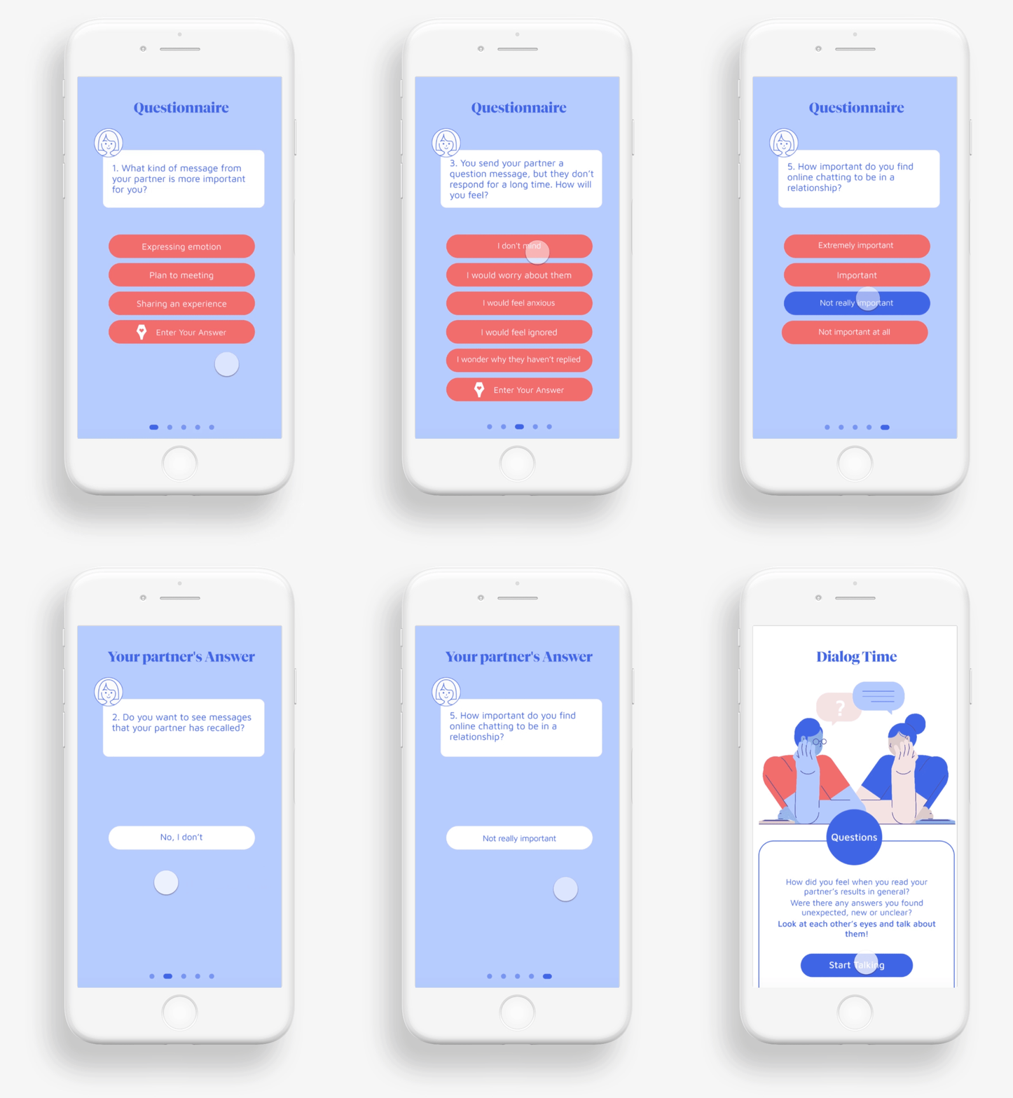
- Questionnaire & Dialog
The first thing to do is helping couples to understand their online chatting attitudes & habits to avoid misunderstanding between them.
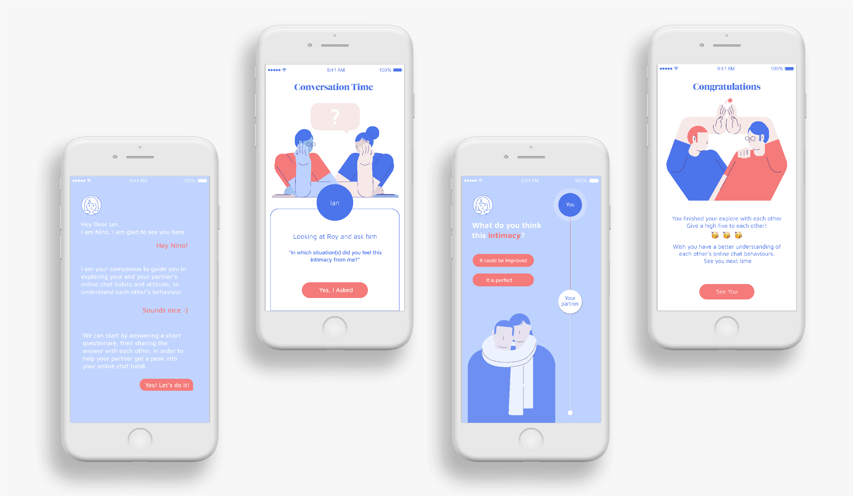
Two catalogues questionnaire help couples to explore their partner’s online chat attitudes, habits. After sharing each other’s answer, start a dialog to talk about their questions.
2. How to lure them to open themselves talk about their problems ?
From couple therapy research. I found out Emotionally Focused Therapy.
"Couples learn to express underlying emotions and ask for their needs to be met...Couples empathic and engaged with each other, strengthening the attachment bond and safe haven between them.”
So the first step to open them is help user to identify their feelings.
So the first step to open them is help user to identify their feelings.
3. How to help couples to identify their own feeling about online chat relationship?
- Psychology expertise research
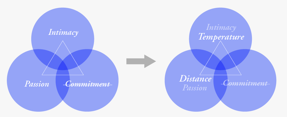
“The triangular theory of love holds that love can be understood in terms of three components that together can be viewed as forming the vertices of a triangle ” from these three components.
I used design visual metaphors to transform abstract feeling into concrete metric.
(I deleted “commitment” which I think is not related to this topic).
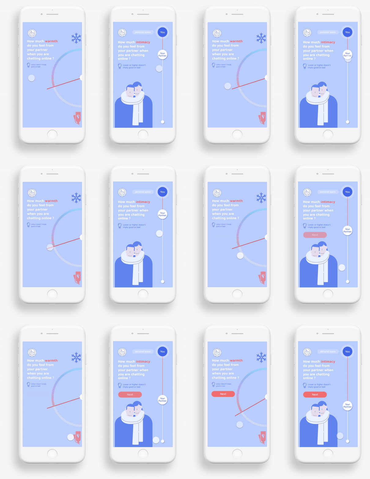
- UX & UI solution
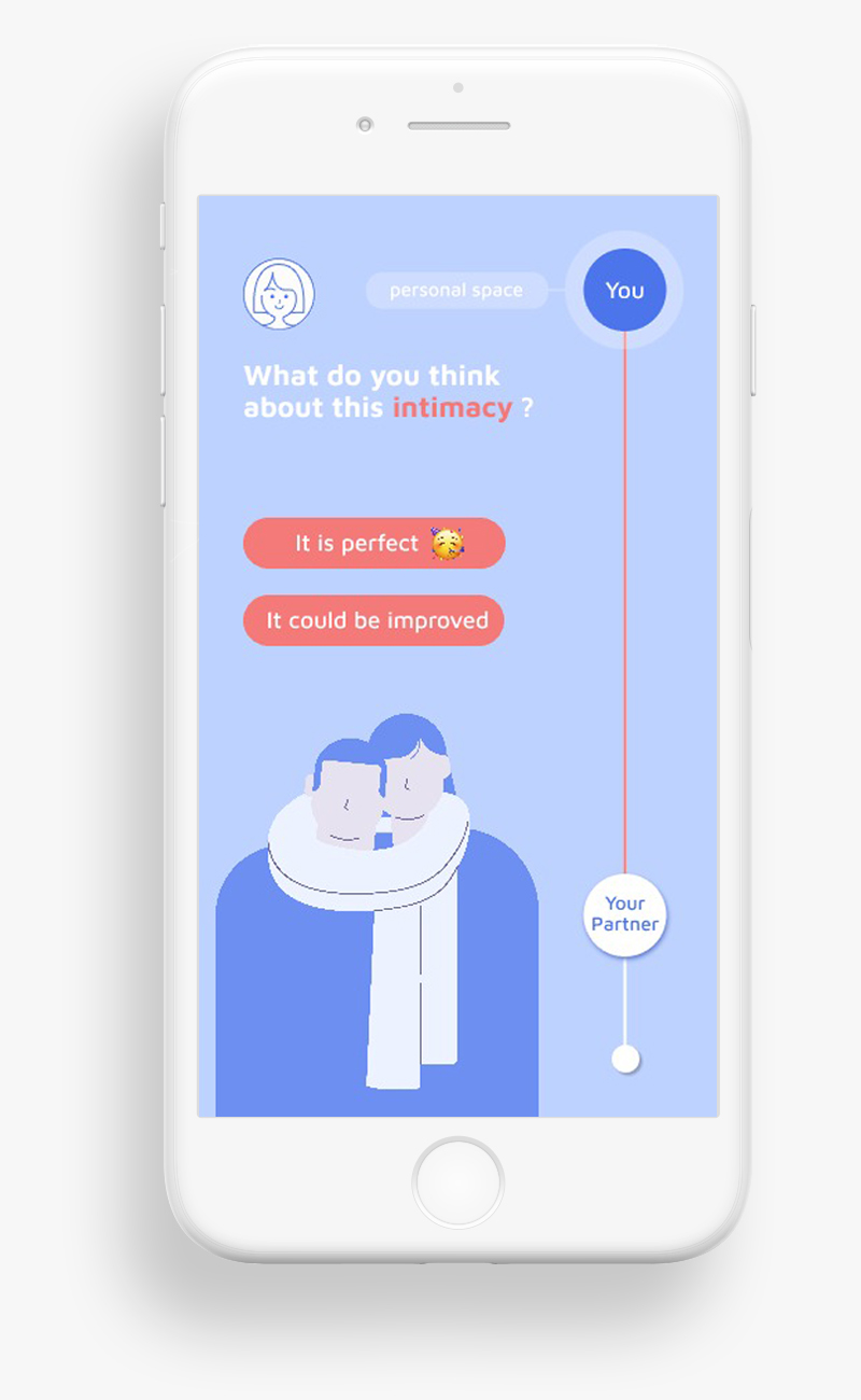
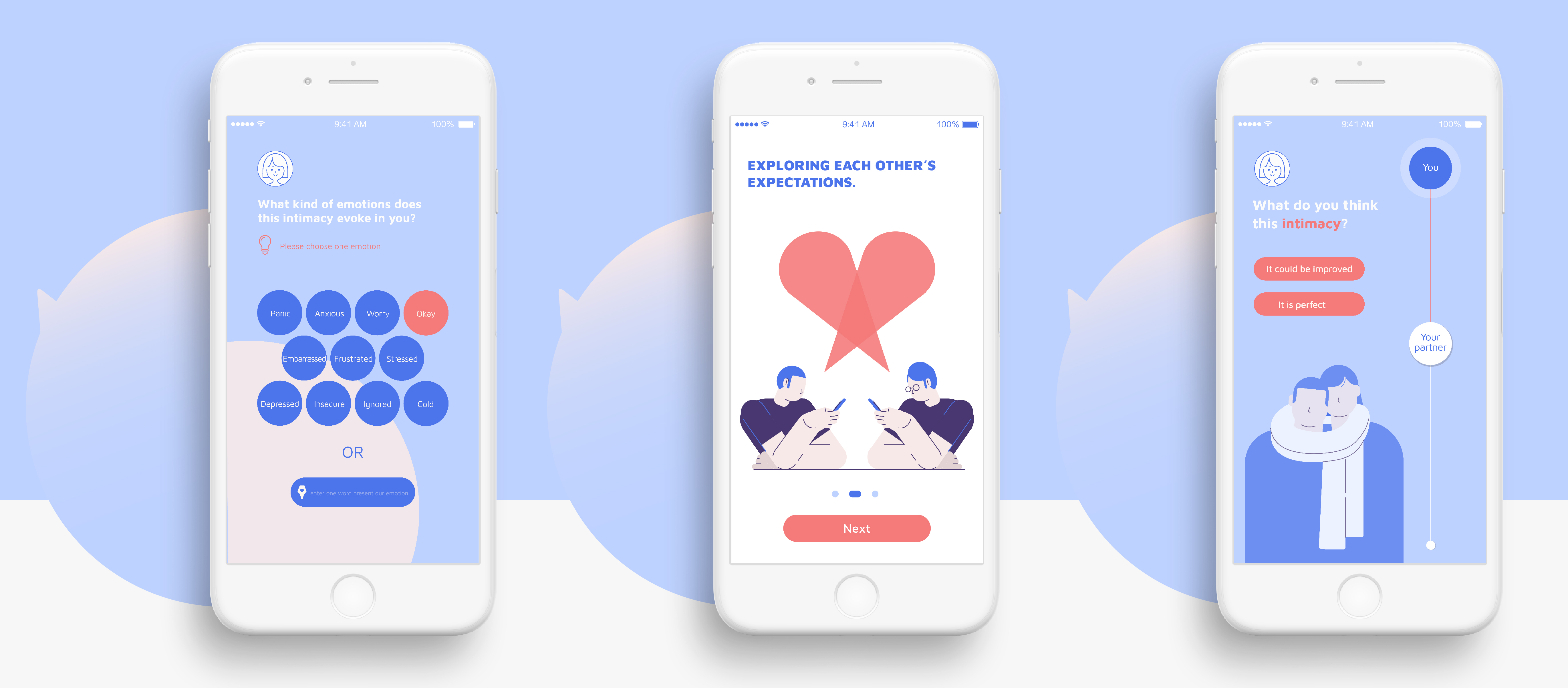
Based on these two visual metaphors, I design user interface - allows couples to identify and visualize their abstract feelings. This UI design helps users can choose their answer in a very easy way.
- Categorize users
Some users want to improve their online chatting relationship, some are not. So next step is asking their opinion in order to categorize users
4. How to guide a conversation that avoids negative arguments?
- Psychology expertise research
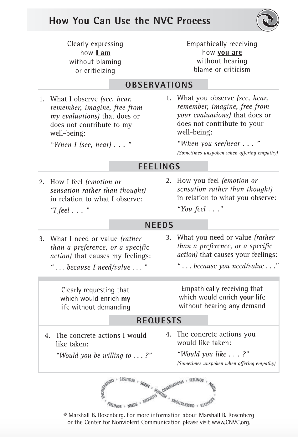
I choose to use the 4-Part Nonviolent Communication Process - most used in couple therapy to guide them to show their expectations.
Nonviolent means being able to express self without blaming, judging, guilting, shaming, or threats. It won’t put partner into defence mode.
- UX & UI Solution
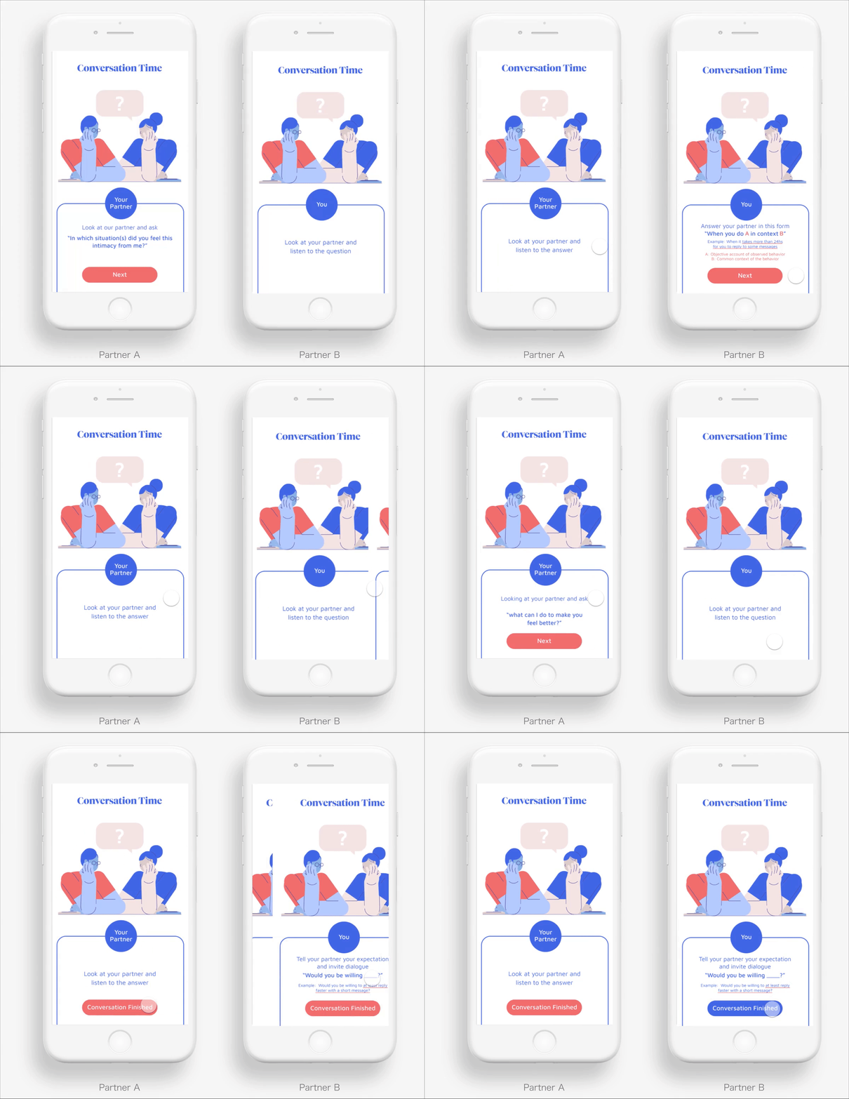
I designed two screens, one person ask question and another person give the answer as the interaction
Each conversation focused on one person’s expectations. Because after user testing, I found in most of cases, couples talking time are not balanced, usually female talk more than male.
User Testing
I started the user testing with my first prototype. During the user testing,
I aim to gain knowledge and feedback from the following aspects:
· The usability
· Improving user experience
· Interface design style testing
Problems - Solution
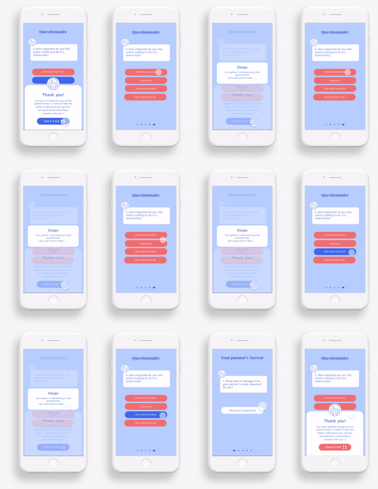
1. Anxious about waiting
Some partners were a bit anxious when they need to wait for their partner enter a conversation.1. Synchronizing users
I did not design a navigation bar or obvious backward button in this app, I hoped that users could follow the App navigation to operate so that too much scheduling malposition between the 2 users could be avoided.
2. Notictification
Add notictification about what their partner doing while the waiting time could help to relieve anxiety.
2. How to delight user experience?
The user experience would be very dull if the users were only required to give the answers without any return.- Adding in some communication tips
Providing some rewards to the users could keep the users to continue using your products. Some communication tips are added after their conversation guide. Some users very appreciated these tips.

3. Interface design style testing
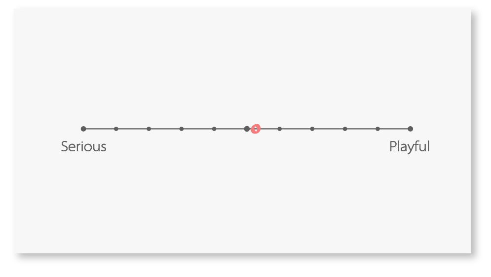
Serious or Playful?I asked every participant to rate their feeling of the interface from serious - playful,and the final score shows it is almost balanced, which matched with my communication goal, I hope that the users could have a relaxing experience which is just like a game, while they would not lose reliance on this app in the meantime.
Learnings
This is my first complete web application project. The most important lesson I have learn is keeping communication with the target audience is vital in order to keep the process relevant and far from assumptions.
This project is a brand new study on couple therapy application, Creating and maintaining sync between two client apps, which is a novel interaction in this kind of application. I have to do many user testings to discover how the UX design will satisfy users.
This project is a brand new study on couple therapy application, Creating and maintaining sync between two client apps, which is a novel interaction in this kind of application. I have to do many user testings to discover how the UX design will satisfy users.

