Project - 2022
![]()
Sustainable info design enhancing conversion

Background
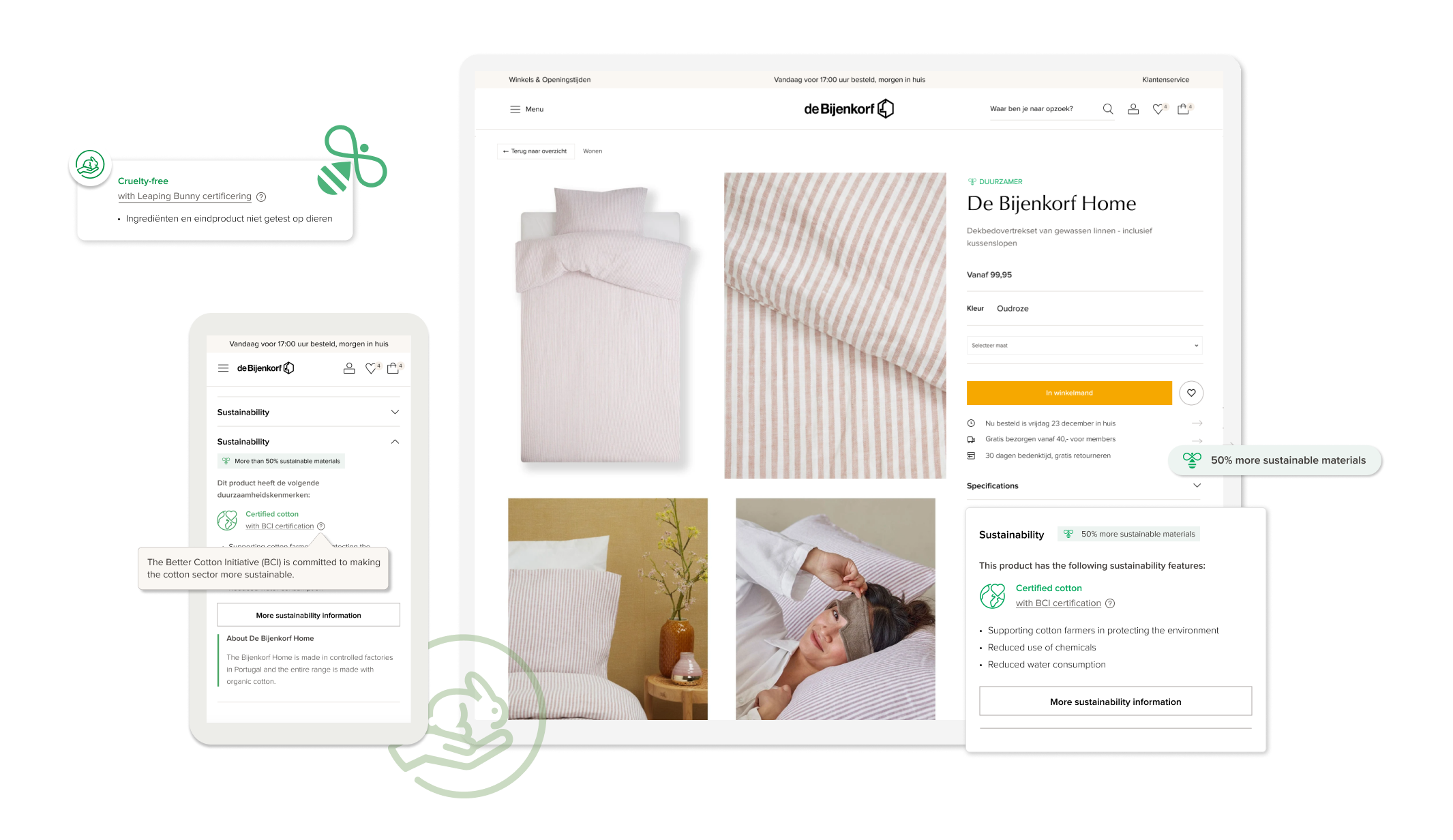
This sustainability project was the first project that I worked in de Bijenkorf, the organization aims to become a top shopping destination for sustainable brands by 2023. My task was to provide the needed sustainability information on the product page
My Role
The business goals
- Increase trustworthiness on sustainability product pages
- Increase conversion rate on the sustainability product page
Outcomes
- Increased the conversion rate by 3,89%
- Increased sustainability trustworthiness by 21%
Stakeholder feedback

What did I do?
![]()

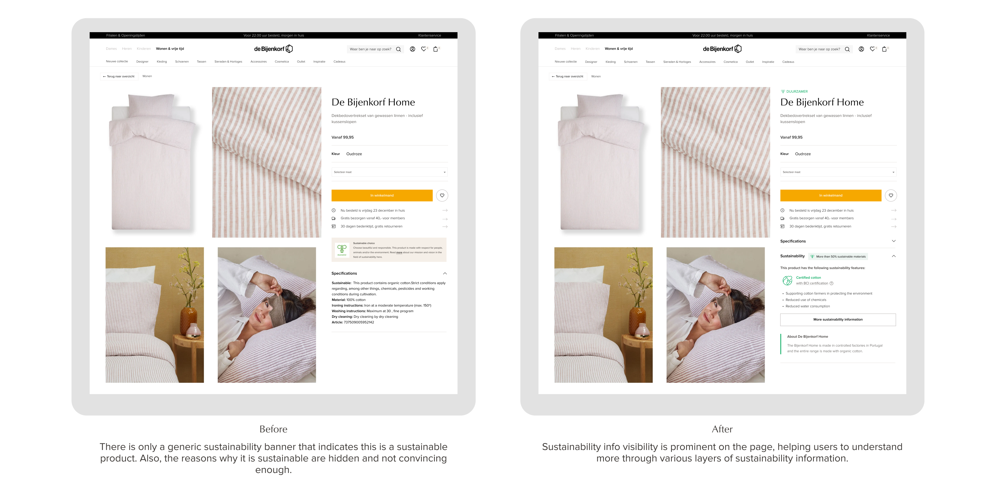
Before & After
CHALLENGE 1
I conducted a user interview aimed at understanding what information do users need to verify whether a product is sustainable. One of the questions was 'What do you need to know about a sustainable product? ' I received many different answers to this question:
Sustainability could mean different things for different people, how to present these information that meet different users’ expectations ?
I conducted a user interview aimed at understanding what information do users need to verify whether a product is sustainable. One of the questions was 'What do you need to know about a sustainable product? ' I received many different answers to this question:

Insights from user interviews
These are very different answers. To meet the diverse expectations of users on the product detail page, I mapped out different user groups and their required information, ranging from basic to advanced needs. This approach aids in creating a foundational information structure and can also guide the sustainability team in creating sustainability content.
![]()

CHALLENGE 2
How to present excessive information for a quick scan?
Sketch, Sketch & Sketches
![]()

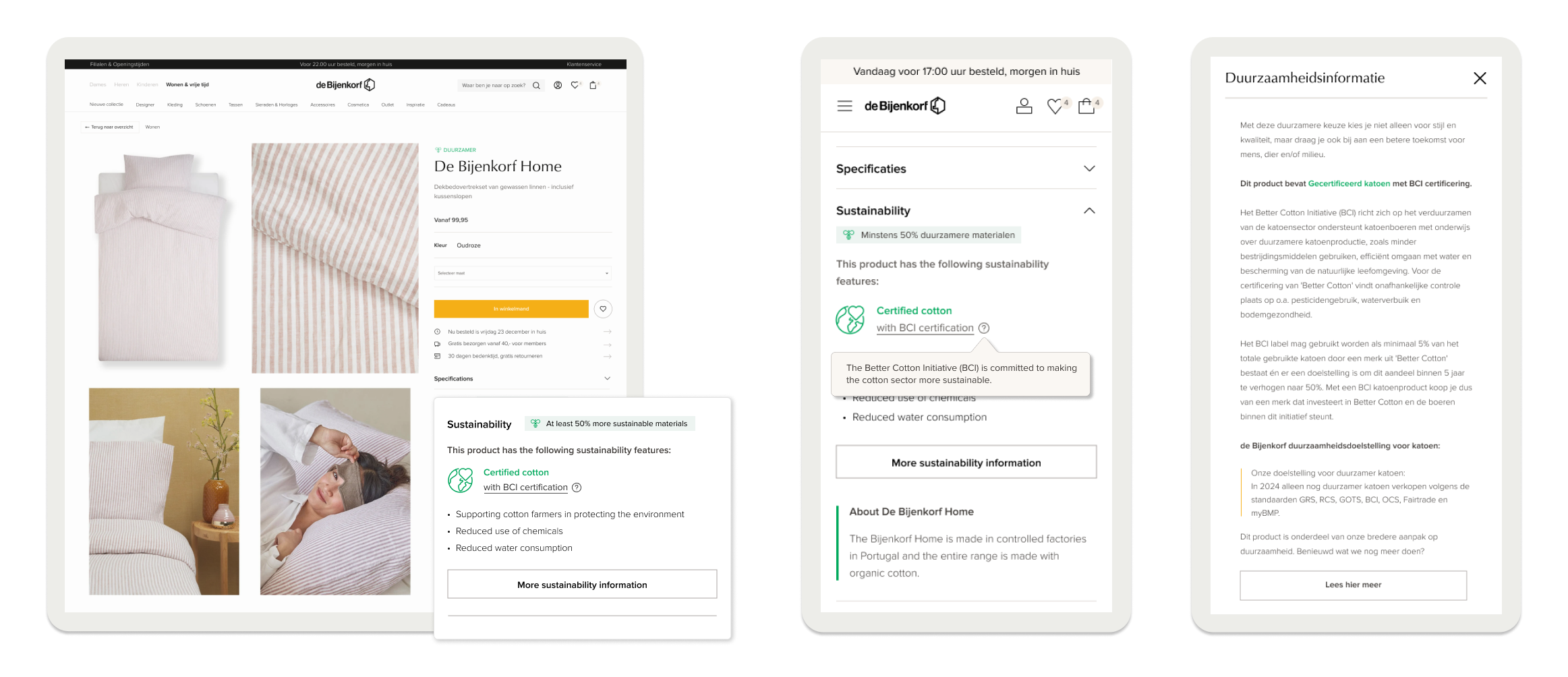
Due to excessive text, they were very difficult to read. I realized that instead of show all the information in a flat way, it is better to structure them in layers that based on the progressive user needs, so users can find from the basic information to the advanced information (like peeling an onion) .
![]()

First design draft

Evaluation - User test
After the initial draft, I conducted a user test to understand how users perceive this design. In general, the design was well-received, although there were a few minor areas that could be improved:
Results:

Other feedback we got from the interviews:
- Participants did not expect the information on the overlay but it is relevant for them, they like the certificates‘ explanations.
- Impact content needs to be more specific
- Some participants have an interest to know more about the brand sustainability vision.
- “Duurzamere keuze" doesn't seem relevant to the product.
- Only 2 ppl saw the tooltip for explaining the certificate details
Iteration
![]()

CHALLENGE 3
How to organise sustainability information that can use for thousands of product pages?
Solution
In this design, I also established an information structure that can be assembled for thousands of distinct products while maintaining consistency across every page. Each combination of sustainability characteristics forms an attribute group, allowing the sustainability team to determine which group to assign to each product.
![]()
In this design, I also established an information structure that can be assembled for thousands of distinct products while maintaining consistency across every page. Each combination of sustainability characteristics forms an attribute group, allowing the sustainability team to determine which group to assign to each product.

Outcomes
This design improved the conversion rate by 3% during the experiment
Increased sustainability trustworthiness by 20%
Received positive feedback from the retail sustainability legal conference
This design improved the conversion rate by 3% during the experiment
Increased sustainability trustworthiness by 20%
Received positive feedback from the retail sustainability legal conference


